Additional plots and customizations
Contents
Additional plots and customizations#
Objective
This vignette contains a wide variety of code snippets for additional plots and plot customizations that are not currently included in our latest version of the jupyter notebook.
Load in dependencies#
# Import mosaic libraries
import missionbio.mosaic as ms
# Import these to display entire dataframes
from IPython.display import display, HTML
# Import graph_objects from the plotly package to display figures when saving the notebook as an HTML
# Import numpy for statistics
import plotly.graph_objects as go
import numpy as np
# Import additional packages for specific visuals
import missionbio.mosaic.utils as mutils
import matplotlib.pyplot as plt
# Import the colors
from missionbio.mosaic.constants import COLORS
import seaborn as sns
Load in data#
sample = ms.load_example_dataset("Multisample PBMC", single=True)
Loading, <_io.BytesIO object at 0x7fd6a8e469a0>
Loaded in 0.6s.
/Users/casp/Documents/code/mosaic/src/missionbio/mosaic/assay.py:329: ChangeAppliedWarning: Multiple samples detected. Appending the sample name to the barcodes to avoid duplicate barcodes. The original barcodes are stored in the original_barcode row attribute
warnings.warn(msg, ChangeAppliedWarning)
Subset the DNA data to look for high quality variants of interest.
# Adjust filters if needed by overwriting dna_vars
dna_vars = sample.dna.filter_variants(
min_dp=10,
min_gq=50,
vaf_ref=5,
vaf_hom=95,
vaf_het=40,
min_prct_cells=70,
min_mut_prct_cells=1,
)
sample.dna = sample.dna[sample.dna.barcodes(), dna_vars]
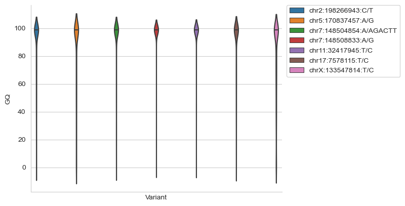
GQ violin plots#
Plot GQ violin plots for all variants of interest to assess genotype quality. It is recommended that this is added before the GQ heatmap, so poor quality variants seen in the violin plots can be subsequently de-selected in the heatmap.
import pandas as pd
GQ_flipped = np.transpose(sample.dna.layers['GQ'])
df = pd.DataFrame(columns=sample.dna.ids())
for i in range(len(sample.dna.ids())):
this_col = df.columns[i]
df[this_col] = GQ_flipped[i,:]
df = pd.melt(df, var_name='Variant', value_name='GQ')
sns.set_style('whitegrid')
sns.violinplot(data = df, x='Variant', y='GQ', hue='Variant', inner='quartile')
plt.xticks([])
plt.legend(bbox_to_anchor=(1.02, 1), loc='upper left', borderaxespad=0)
sns.despine()
Identify the subclones present in your sample.
#Plot a heatmap of the variant allele frequenices being called across your variants of interest
sample.dna.heatmap(attribute='AF_MISSING')
#Annotate the DNA variants
annotation = sample.dna.get_annotations()
# Store the annotations in the dna assay as a new column attribute
for col, content in annotation.items():
sample.dna.add_col_attr(col, content.values)
# Add annotation to the id names
sample.dna.set_ids_from_cols(["Gene", "CHROM", "POS", "REF", "ALT"])
# Annotations are now added to the variants
sample.dna.ids()
array(['SF3B1:2:198266943:C:T', 'NPM1:5:170837457:A:G',
'EZH2:7:148504854:A:AGACTT', 'EZH2:7:148508833:A:G',
'WT1:11:32417945:T:C', 'TP53:17:7578115:T:C',
'PHF6:X:133547814:T:C'], dtype=object)
#Cluster the data to identify the subclones present
clone_data = sample.dna.group_by_genotype(features=sample.dna.ids(), group_missing=True, min_clone_size=1, layer="NGT_FILTERED", show_plot=True)
display(HTML(clone_data.to_html()))
/Users/casp/Documents/code/mosaic/src/missionbio/mosaic/dna.py:792: UserWarning:
Switching to the collapsed plot for improved performance. Pass show_plot='all' to show all the clones.
| clone | 1 | 2 | Missing GT clones (409) | Small subclones (22) | ADO clones (0) |
|---|---|---|---|---|---|
| SF3B1:2:198266943:C:T | Hom (99.54%) | Hom (99.65%) | Missing in 13.54% of cells | Hom (99.3%) | NaN |
| NPM1:5:170837457:A:G | WT (0.47%) | Hom (99.58%) | Missing in 20.29% of cells | Hom (65.65%) | NaN |
| EZH2:7:148504854:A:AGACTT | WT (0.28%) | Het (62.06%) | Missing in 28.74% of cells | WT (31.91%) | NaN |
| EZH2:7:148508833:A:G | WT (0.72%) | Het (60.0%) | Missing in 23.03% of cells | Het (37.37%) | NaN |
| WT1:11:32417945:T:C | Het (58.35%) | WT (0.49%) | Missing in 22.34% of cells | WT (15.53%) | NaN |
| TP53:17:7578115:T:C | Hom (99.8%) | Het (58.84%) | Missing in 26.93% of cells | Het (70.96%) | NaN |
| PHF6:X:133547814:T:C | Hom (99.61%) | WT (0.41%) | Missing in 18.40% of cells | WT (34.34%) | NaN |
| Total Cell Number | 490 (13.06%) | 189 (5.04%) | 2975 (79.31%) | 97 (2.59%) | NaN |
| Sample 1 Cell Number | 8 (0.41%) | 183 (9.42%) | 1690 (86.98%) | 62 (3.19%) | NaN |
| Sample 2 Cell Number | 482 (26.66%) | 6 (0.33%) | 1285 (71.07%) | 35 (1.94%) | NaN |
| Parents | NaN | NaN | NaN | NaN | NaN |
| Sisters | NaN | NaN | NaN | NaN | NaN |
| ADO score | 0 | 0 | NaN | NaN | NaN |
#Rename the subclones and drop the clones that are not of interest by labelling them 'FP'
sample.dna.rename_labels(
{
'1': 'Clone 1',
'2': 'Clone 2',
'missing': 'FP',
'small': 'FP'
}
)
# Remove barcodes (clones) from data based on renamed labels
# The reduced data set will now be called 'sample.dna2'
fp_barcodes = sample.dna.barcodes({"FP"})
sample.dna2 = sample.dna.drop(fp_barcodes)
set(sample.dna2.get_labels())
{'Clone 1', 'Clone 2'}
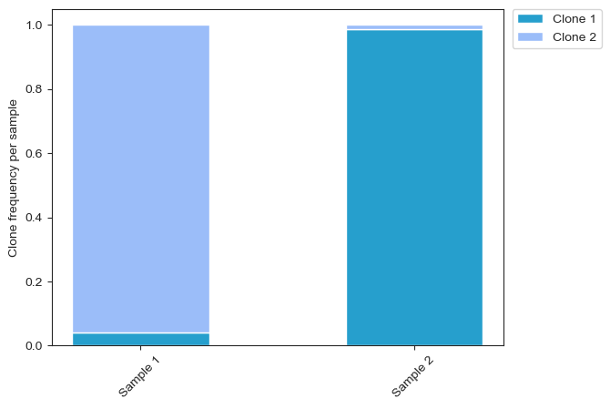
Stacked bar graph for multi-sample analysis#
Plot a stacked bar graph for clone frequency within each sample, where each sample is an individual bar. Note colors can be changed, as can labels. Graph is highly customizable, but large amounts of code may deter users.
a = sample.dna2.row_attrs['sample_name']
a_list = a.tolist()
b = sample.dna2.row_attrs['label']
b_list = b.tolist()
ab = list(zip(a_list, b_list))
counts_dic = {}
sample_tots = {}
for item in ab:
s = item[0]
if s not in sample_tots:
sample_tots[s] = 1
else:
sample_tots[s] += 1
if s not in counts_dic:
counts_dic[s] = {}
clone = item[1]
if clone not in counts_dic[s]:
counts_dic[s][clone] = 1
else:
counts_dic[s][clone] += 1
freq_dic = {}
sample_names = []
for s in counts_dic:
sample_names.append(s)
s_tot = sample_tots[s]
for c in counts_dic[s]:
freq = float(counts_dic[s][c])/float(s_tot)
if c not in freq_dic:
freq_dic[c] = [freq]
else:
freq_dic[c].append(freq)
x = [i for i in range(len(sample_names))]
#IMPORTANT NOTE: DO NOT ALTER ANYTHING ABOVE THIS COMMENT
width = .5
sns.set_style('ticks')
#One line item per clone
#After first line, add all previous clone data to the 'bottom' of the next bar
#Insert your clone names
#Colors can be custom, insert preferred hex-codes
clone_1 = plt.bar(x, freq_dic['Clone 1'], width, color='#269FCD')
clone_2 = plt.bar(x, freq_dic['Clone 2'], width, bottom=freq_dic['Clone 1'], color='#9BBDF9')
#clone_3 = plt.bar(x, freq_dic['Clone 3'], width, bottom=np.array(freq_dic['Clone 1'])+np.array(freq_dic['Clone 2']), color='#67AAf9')
plt.xticks(x, sample_names, rotation=45)
plt.ylabel('Clone frequency per sample')
plt.legend((clone_1, clone_2), ('Clone 1', 'Clone 2'), bbox_to_anchor=(1.02, 1), loc='upper left', borderaxespad=0)
<matplotlib.legend.Legend at 0x7fd6bdce0940>
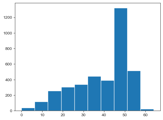
Reads per amplicon#
Plot a histogram of the reads per cell across any given amplicon, and print out the mean reads per cell of that amplicon.
reads = sample.dna.get_attribute('DP', constraint='row+col')
amplicons = sample.dna.col_attrs['amplicon']
amp_average = reads.groupby(amplicons, axis=1).mean()
#Insert your amplicon of interest below
DP = amp_average['MYE_SF3B1_198266730']
#Print the mean
print(np.mean(DP))
#Plot histogram
plt.hist(DP)
39.1149026926153
(array([ 37., 118., 255., 305., 340., 444., 393., 1321., 514.,
24.]),
array([ 0. , 6.4, 12.8, 19.2, 25.6, 32. , 38.4, 44.8, 51.2, 57.6, 64. ]),
<a list of 10 Patch objects>)
Count barcodes with at least one mutation#
Define a region of interest, and then call cell-barcodes that have a least one mutation in that region of interest. This code may be useful for gene-editing experiments where you are expecting mutations on a particular amplicon, or within a small region of the amplicon surrounding a cut-site.
#Define an amplicon of interest
amp = 'MYE_SF3B1_198266730'
print (amp in set(sample.dna.col_attrs['amplicon'])) #sanity check
#Filter the data to only look at variants called from this amplicon
filt = sample.dna.col_attrs["amplicon"] == amp
variants = sample.dna.ids()[filt]
sample.dna = sample.dna[:, variants]
#THE FOLLOWING SECTION IS OPTIONAL
#filtering variants by cut site
#e.g. cut site at chr2:60722401, range 60722481 - 60722421
#filt2 = sample.dna.col_attrs["POS"] > 60722381
#variants2 = sample.dna.ids()[filt2]
#sample.dna = sample.dna[:, variants2]
#filt3 = sample.dna.col_attrs["POS"] < 60722421
#variants3 = sample.dna.ids()[filt3]
#sample.dna = sample.dna[:, variants3]
#counting barcodes with at least one mutation in region of interest(Het or Hom call)
#creating a dataframe with numeric genotypes
genotypes = sample.dna.get_attribute('NGT_FILTERED', constraint='row+col')
#set WT to True
zero_bool = (genotypes == 0)
#number of WT calls per each cell
zero_bool.sum(axis=1)
#set missing to True
missing_bool = (genotypes == 3)
#number of Missing calls per each cell
missing_bool.sum(axis=1)
#number of Het and Hom calls per barcode
#len(genotypes.columns) is the total number of variants
barcode_muts = len(genotypes.columns) - (missing_bool.sum(axis=1) + zero_bool.sum(axis=1))
#number of barcodes with one or more mutations
barcode_muts_bool = (barcode_muts > 0)
print(barcode_muts_bool.sum())
True
3243
Custom cluster order#
For sample.dna or sample.cnv grouped heatmaps in Mosaic notebook, this code will help you order the clones along the Y-axis in whatever order you prefer.
import pandas as pd
#get the 'barcodes' and the labels information from the sample.dna object
#label is the attribute that will be used for ordering cell groups
#labels are stored in the 'clusters' variable
barcodes = sample.dna2.row_attrs['barcode']
clusters = sample.dna2.row_attrs['label']
#combining barcodes and clusters into one single numpy array
combined = np.vstack((barcodes, clusters)).T
#creating a pandas data frame based on the numpy array
df = pd.DataFrame(combined, columns = ['cell','cluster'])
#create a list 'cell_clusters' with the desired order of the clusters
#In this example, clusters are labeled numerically, i.e. 1, 2, 3,...
#Use the labels you have previously created for the clones
cell_clusters = ['Clone 1', 'Clone 2']
#recreate the 'cluster' column in the pandas data frame, but as a categorical column
df["cluster"] = pd.Categorical(df["cluster"], categories = cell_clusters)
#group the barcodes by cluster
df_sorted = df.sort_values(by = "cluster")
#change data type (back to numpy)
ordered_cells = df_sorted.cell.values.tolist()
ordered_cells = np.array(ordered_cells)
#call the plot again, use 'ordered_cells' to specify the order
sample.dna2.heatmap(attribute='AF_MISSING', bars_order = ordered_cells)
Custom heatmap legend#
For grouped sample.dna heatmaps, after clones are identified and labeled, this helps to remove unnecessary categories from the legend, for example the ‘Missing’ category.
#Customize legend to show only three categories
#e.g. WT, HET, HOM
#if the data are filtered, to remove the missing genotypes, the 'Missing' category will still appear in the legend
fig = sample.dna2.heatmap(attribute = 'NGT_FILTERED')
#Define the categories you want to appear
fig.layout.coloraxis.colorbar.ticktext = ('WT', 'HET', 'HOM')
fig.layout.coloraxis.colorbar.tickvals = (0.375, 1.025, 1.675)
fig.layout.coloraxis.cmax = 2
fig.layout.coloraxis.colorscale = [[0.0, '#3b4d73'], [0.33, '#3b4d73'], [0.33, '#78a3bc'], [0.66, '#78a3bc'], [0.66, '#d7ecee'], [1.0, '#d7ecee']]
fig
Perform CNV analysis on your data#
reads = sample.cnv.get_attribute('read_counts', constraint='row+col')
reads
| MYE_ASXL1_31022366 | MYE_ASXL1_31022711 | MYE_ASXL1_31022977 | MYE_ASXL1_31023229 | MYE_ASXL1_31023478 | MYE_ASXL1_31023678 | MYE_ASXL1_31023938 | MYE_ASXL1_31024173 | MYE_ASXL1_31024623 | MYE_ASXL1_31024877 | ... | MYE_ZRSR2_15817959 | MYE_ZRSR2_15821773 | MYE_ZRSR2_15822168 | MYE_ZRSR2_15826277 | MYE_ZRSR2_15827302 | MYE_ZRSR2_15833836 | MYE_ZRSR2_15838246 | MYE_ZRSR2_15840789 | MYE_ZRSR2_15841002 | MYE_ZRSR2_15841178 | |
|---|---|---|---|---|---|---|---|---|---|---|---|---|---|---|---|---|---|---|---|---|---|
| read_counts | |||||||||||||||||||||
| AACAACCTACAATCATAC-Sample 1 | 0 | 5 | 32 | 12 | 7 | 21 | 22 | 9 | 13 | 12 | ... | 12 | 4 | 7 | 54 | 3 | 17 | 3 | 6 | 0 | 15 |
| AACAACCTACATCTCACG-Sample 2 | 0 | 8 | 7 | 11 | 4 | 11 | 27 | 5 | 3 | 12 | ... | 9 | 5 | 4 | 37 | 4 | 20 | 25 | 13 | 0 | 12 |
| AACAACCTAGACGTCAAT-Sample 2 | 0 | 7 | 25 | 11 | 10 | 9 | 34 | 3 | 3 | 19 | ... | 47 | 8 | 23 | 47 | 4 | 33 | 31 | 12 | 0 | 7 |
| AACAACCTAGCCTTATCT-Sample 2 | 0 | 14 | 18 | 24 | 33 | 14 | 43 | 13 | 14 | 19 | ... | 74 | 2 | 19 | 42 | 43 | 21 | 7 | 8 | 0 | 14 |
| AACAACCTATACCGATTG-Sample 2 | 1 | 3 | 10 | 10 | 9 | 4 | 27 | 15 | 13 | 13 | ... | 6 | 10 | 26 | 43 | 17 | 40 | 30 | 11 | 0 | 35 |
| ... | ... | ... | ... | ... | ... | ... | ... | ... | ... | ... | ... | ... | ... | ... | ... | ... | ... | ... | ... | ... | ... |
| TTGTATCACGAGGTGAGC-Sample 2 | 2 | 6 | 48 | 10 | 16 | 13 | 27 | 20 | 22 | 26 | ... | 1 | 12 | 17 | 52 | 7 | 15 | 4 | 7 | 0 | 68 |
| TTGTATCACTTATCGCAC-Sample 1 | 0 | 32 | 59 | 41 | 27 | 32 | 55 | 39 | 37 | 30 | ... | 0 | 9 | 37 | 107 | 37 | 73 | 49 | 22 | 0 | 82 |
| TTGTCAACCGATGCTCCT-Sample 1 | 1 | 8 | 7 | 13 | 14 | 17 | 35 | 4 | 12 | 16 | ... | 28 | 4 | 3 | 39 | 10 | 40 | 8 | 5 | 0 | 9 |
| TTGTTAGAGTATACCACT-Sample 1 | 0 | 0 | 19 | 6 | 8 | 19 | 10 | 7 | 14 | 20 | ... | 20 | 14 | 13 | 44 | 12 | 25 | 13 | 13 | 0 | 12 |
| TTGTTAGAGTTCGCATCC-Sample 1 | 0 | 16 | 10 | 8 | 6 | 18 | 14 | 3 | 14 | 11 | ... | 44 | 15 | 18 | 26 | 2 | 7 | 2 | 12 | 0 | 39 |
3751 rows × 312 columns
working_amplicons = (reads.median() > 0).values
sample.cnv = sample.cnv[:, working_amplicons]
sample.cnv2 = sample.cnv[sample.dna2.barcodes(),:]
sample.cnv2.normalize_reads()
#Normalize your amplicons to a WT/known diploid population
sample.cnv2.compute_ploidy(diploid_cells=sample.dna.barcodes('Clone 1'))
sample.cnv2.set_labels(sample.dna2.get_labels())
sample.cnv2.set_palette(sample.dna2.get_palette())
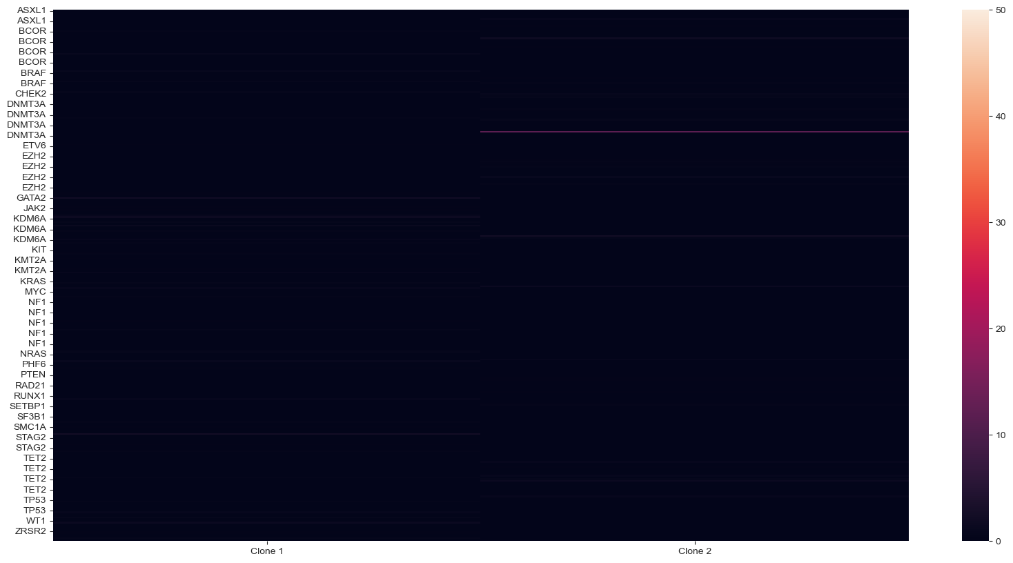
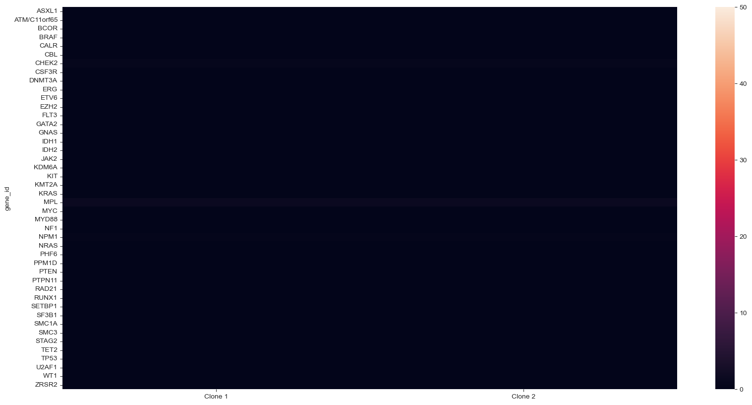
P-value chart per gene#
For CNV statistics, this code will allow you to show the pval_cnv chart with gene name labels, instead of amplicon names. Note: if there are multiple amplicons per gene, the gene name will appear for each amplicon, and this is not an aggregate p-val across the entire gene.
sample.cnv2.get_gene_names()
pval_cnv, tstat_cnv = sample.cnv2.test_signature("normalized_counts")
pval_cnv.columns = sample.cnv2.col_attrs['gene_name']
pval_cnv = pval_cnv + 10 ** -50 + pval_cnv
tstat_cnv.columns = sample.cnv2.col_attrs['gene_name']
pvals_cnv = -np.log10(pval_cnv) * (tstat_cnv > 0)
plt.figure(figsize=(20, 10))
fig = sns.heatmap(pvals_cnv.T, vmax=50, vmin=0)
Calculate an average P-value per gene#
For CNV statistics, this code will allow you to show the average p-value per gene in a heatmap format, instead of at an amplicon level.
#statistics
pval_cnv, tstat_cnv = sample.cnv2.test_signature("normalized_counts")
#replace amplicon IDs by gene names
pval_cnv.columns = sample.cnv2.col_attrs['gene_name']
#transpose the data frame
tpval_cnv = pval_cnv.T
#add column header to the index
tpval_cnv.index.rename('gene_id', inplace=True)
#average the p-values by gene_id and transpose
ttpval_cnv = tpval_cnv.groupby('gene_id').mean().T
ttpval_cnv = ttpval_cnv + 10 ** -50 + ttpval_cnv
#plot it
pvals_cnv = -np.log10(ttpval_cnv)
plt.figure(figsize=(20, 10))
fig = sns.heatmap(pvals_cnv.T, vmax=50, vmin=0)
Protein read distribution tool#
This code will read in your h5 file, and spit out a table of your antibodies, the raw read counts and what percentage of total counts the antibody accounts for, as well as a pie graph of antibody percentages, or a bar chart.
import pandas as pd
read_counts= sample.protein.layers["read_counts"]
ids = sample.protein.col_attrs["id"].copy()
raw = pd.DataFrame(read_counts, columns=ids)
total_ab = pd.DataFrame(raw.sum(axis = 0, skipna = True))
total_ab.columns =['Raw Count']
total_ab.index.name = 'Antibody'
total_ab.reset_index(inplace=True)
total_ab['percent'] = (total_ab['Raw Count'] / total_ab['Raw Count'].sum()) * 100
print(total_ab)
#Pie chart
#fig = px.pie(total_ab, values='Raw Count',names='Antibody', title='Sum of Raw')
#Bar chart
fig = px.bar(total_ab, x='Antibody', y='percent')
fig.show()
Antibody Raw Count percent
0 CD10 216964 0.378954
1 CD117 343388 0.599770
2 CD11b 1976532 3.452258
3 CD11c 1448022 2.529150
4 CD123 1263044 2.206063
5 CD13 983932 1.718559
6 CD138 590295 1.031023
7 CD14 1280941 2.237322
8 CD141 692292 1.209174
9 CD16 2276106 3.975501
10 CD163 582052 1.016626
11 CD19 456095 0.796626
12 CD1c 332980 0.581591
13 CD2 1588429 2.774388
14 CD22 244551 0.427139
15 CD25 252888 0.441700
16 CD3 4431120 7.739499
17 CD30 494197 0.863176
18 CD303 207141 0.361797
19 CD304 125132 0.218559
20 CD33 1460364 2.550706
21 CD34 184545 0.322331
22 CD38 2048252 3.577526
23 CD4 3998551 6.983964
24 CD44 3832460 6.693866
25 CD45 4025459 7.030962
26 CD45RA 4077514 7.121883
27 CD45RO 643098 1.123250
28 CD49d 2033111 3.551080
29 CD5 1890299 3.301641
30 CD56 801676 1.400226
31 CD62L 1942536 3.392879
32 CD62P 147567 0.257744
33 CD64 502127 0.877027
34 CD69 325517 0.568556
35 CD7 2520817 4.402919
36 CD71 979444 1.710720
37 CD8 3539863 6.182809
38 CD83 721215 1.259691
39 CD90 137773 0.240638
40 FcεRIα 527347 0.921077
41 HLA-DR 828210 1.446571
42 IgG1 116941 0.204252
43 IgG2a 90132 0.157427
44 IgG2b 92397 0.161383
#Normalize protein counts
sample.protein.normalize_reads('CLR')
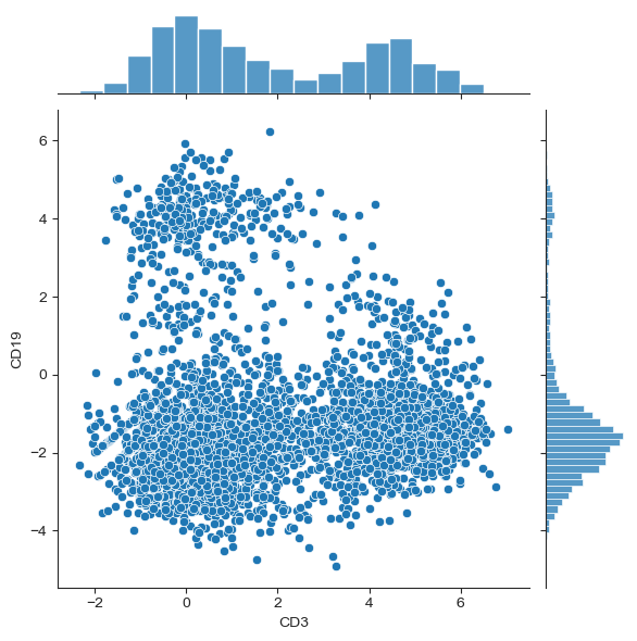
Plot a joint scatterplot and histogram#
This will create a scatterplot of any two proteins, where additional histograms of the protein expression profile will be shown on the sides of the scatterplots.
#Plot a joint scatterplot with histograms of two proteins of interest
#for more: https://seaborn.pydata.org/generated/seaborn.jointplot.html
#create data frame with normalised protein counts ("protein_df")
protein_df = sample.protein.get_attribute('normalized_counts', constraint='row+col')
#specify the proteins of choice using the "x" and "y" arguments
sns.jointplot(x = "CD3", y = "CD19", data = protein_df)
<seaborn.axisgrid.JointGrid at 0x7fd6989f2d30>
#Create a new sample object for multi-omics visualizations
x = sample.protein.barcodes()
y = sample.dna2.barcodes()
z = np.intersect1d(x, y)
len(z)
# Subset protein data to include only barcodes that were included in both analytes and store in sample.protein.3 variable
sample.protein3 = sample.protein[z,sample.protein.ids()]
# Subset dna data to include only barcodes that were included in both analytes and store in sample.dna.3 variable
sample.dna3 = sample.dna2[z,sample.dna2.ids()]
#Update each sub-class (e.g., DNA, CNV, Protein) in order to visualize "clean" data only with relevant features and cells.
sample2 = sample
#sub-assays
sample2.dna = sample.dna3
sample2.cnv = sample.cnv2
sample2.protein = sample.protein3
CNV signature per chromosome#
This code is for the first heatmap plot in the multi-assay section of the Mosaic notebook (DNA cluster signature vs Analyte and Barcode). It allows you to show average ploidy per chromosome in the CNV section of the heatmap, instead of by amplicon or gene.
# Calculate mean ploidy for each chromosome
amp_ploidy = sample.cnv.get_attribute("ploidy", "rc")
chrom = "chr" + sample.cnv.col_attrs["CHROM"]
chrom_ploidy = amp_ploidy.groupby(chrom, axis=1).mean()
# Create an assay with the ploidy values
chrom_sample = sample[:]
chrom_cnv = chrom_sample.cnv[:, :]
chrom_cnv.select_columns([0] * chrom_ploidy.shape[1])
chrom_cnv.col_attrs = {"id": np.array(chrom_ploidy.columns)}
chrom_cnv.layers = {
"read_counts": np.zeros(chrom_ploidy.shape), # Empty data needed for the heatmap function
"normalized_counts": chrom_ploidy.values # The multi sample heatmap plots this layer
}
chrom_sample.cnv = chrom_cnv
# Draw normal heatmap
chrom_sample.cnv.heatmap("normalized_counts")
# Draw multi-assay heatmap
chrom_sample.heatmap("dna", "protein", flatten=False)
Save output for one clone#
This code will output a filtered h5 file, containing only cells of the clone of interest, which can be used for further analysis or filtering.
#save one clone (or one sample) as a separate .h5 file
#row attribute 'label' stores the group (e.g. clone) information
#set the sampleID to match the clone that you would like to extract from the others
sampleID = 'Clone 2'
#create a filter based on sampleID
filt = sample.dna.row_attrs["label"] == sampleID
#create a new dna layer under the same sample
#sample.dna2 contains only the barcodes from the selected group
sample.dna2 = sample.dna[filt, :]
#create a new sample
sample2 = sample
#transfer the layer sample.dna2 to the new sample
sample2.dna = sample.dna2
#save sample2 to disk
ms.save(sample2, "Clone2_FilteredOnly.h5")